
Bank of America
ATM, Bank of America, is one of my passion projects. The reason why I started this project because most designers tend to focus on designing applications due to it becoming a popular thing nowadays. However, I was wondering :
There are still so many products that need to be improved, like ATMs. After I went to Wells Fargo, Chase, and Bank of America in downtown SF for research, the result is the ATM in Bank of America needs to redesign the most. This project spanned around three months from research to user testing.
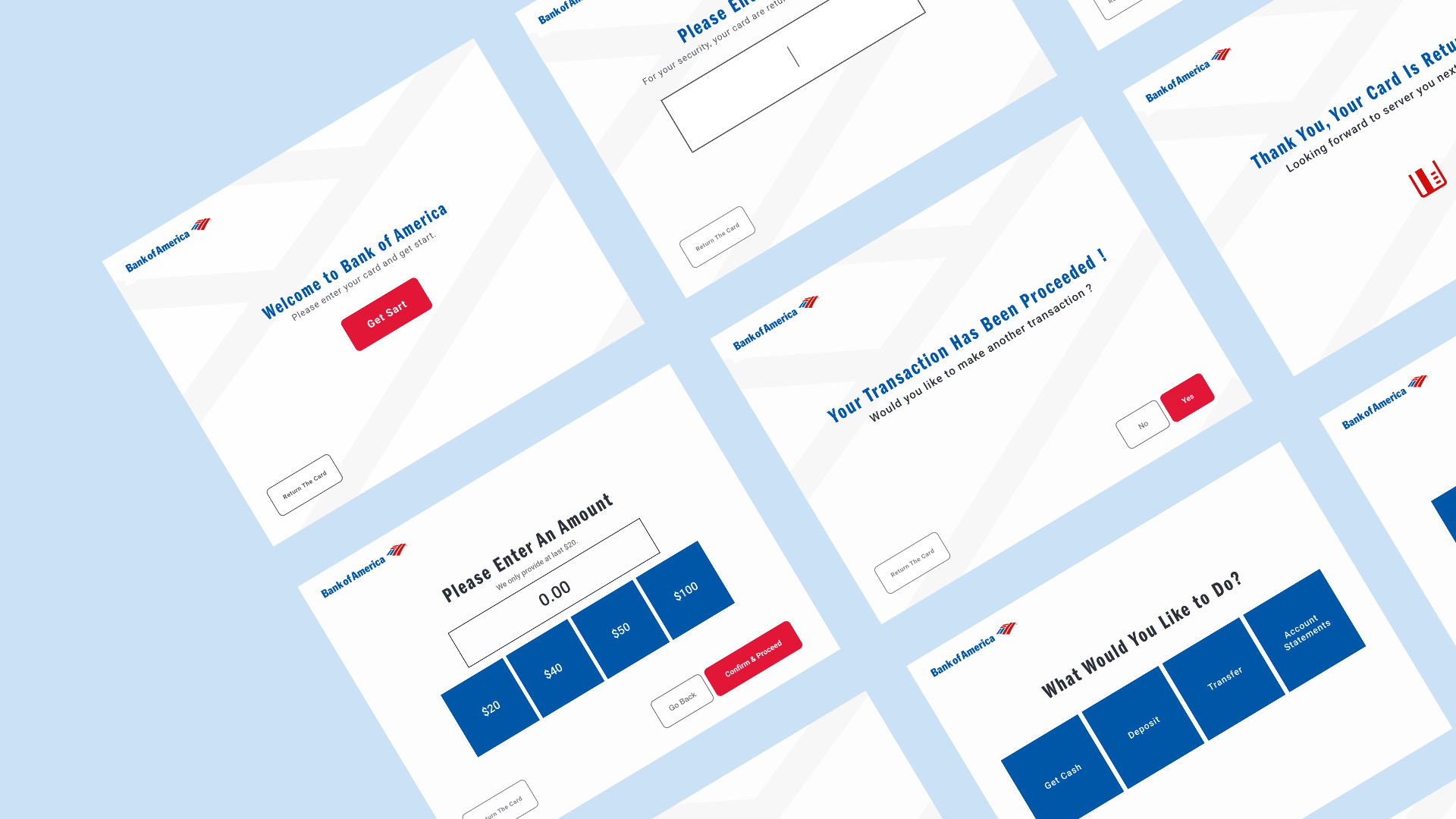
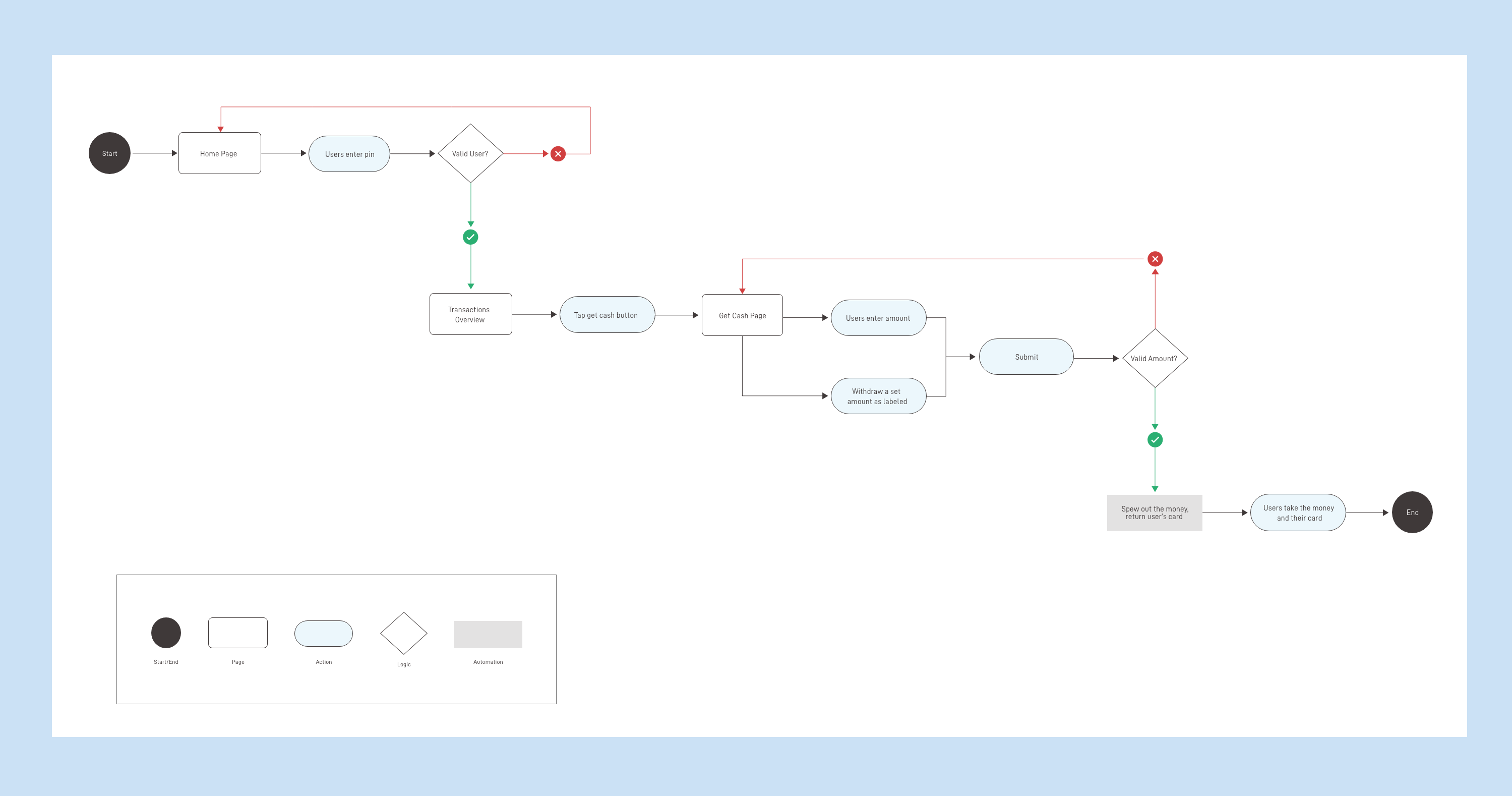
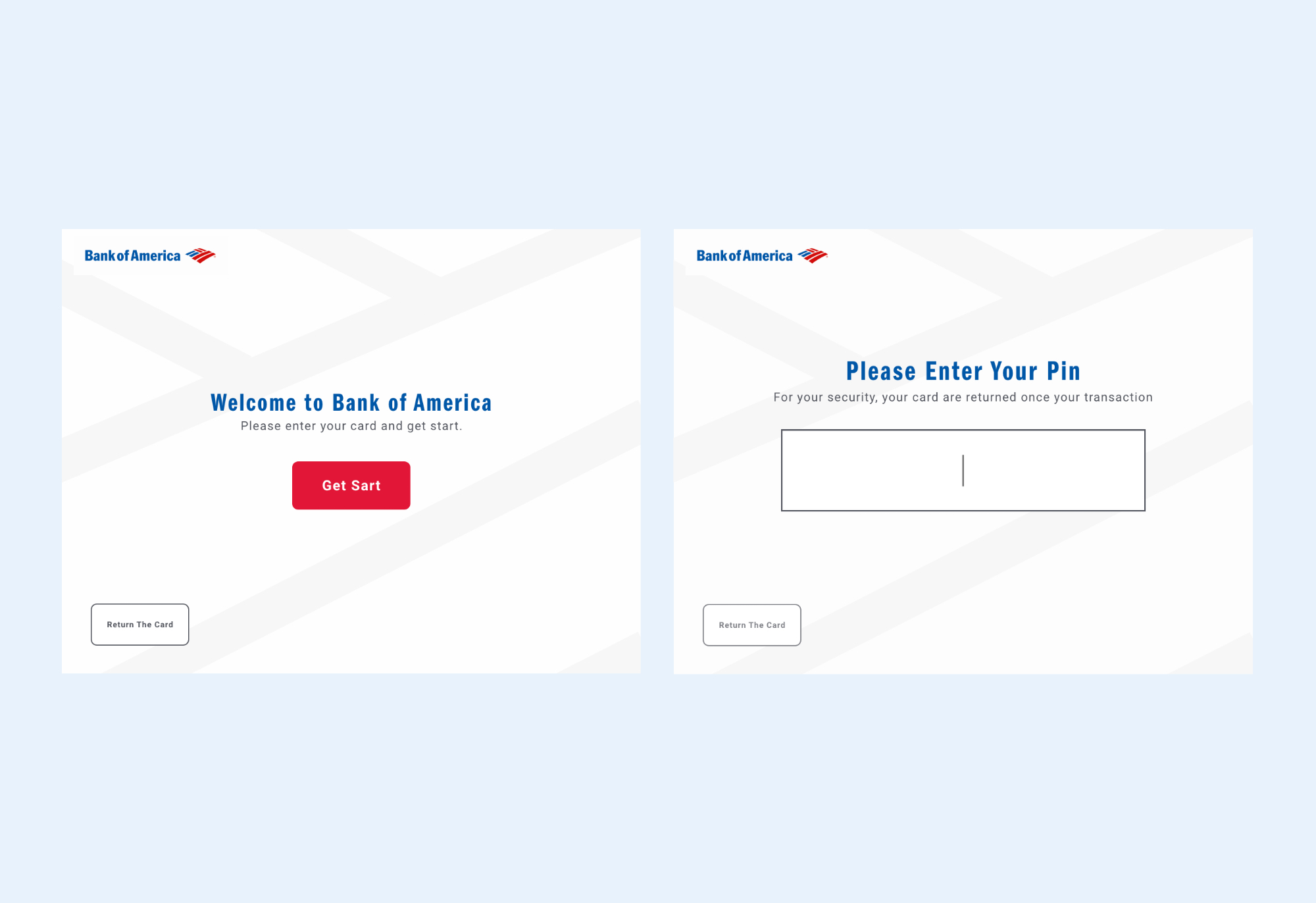
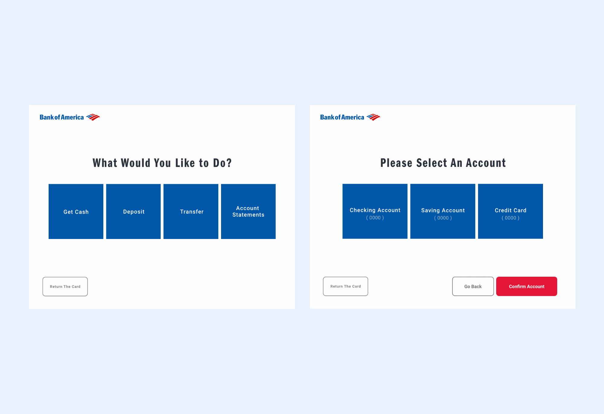
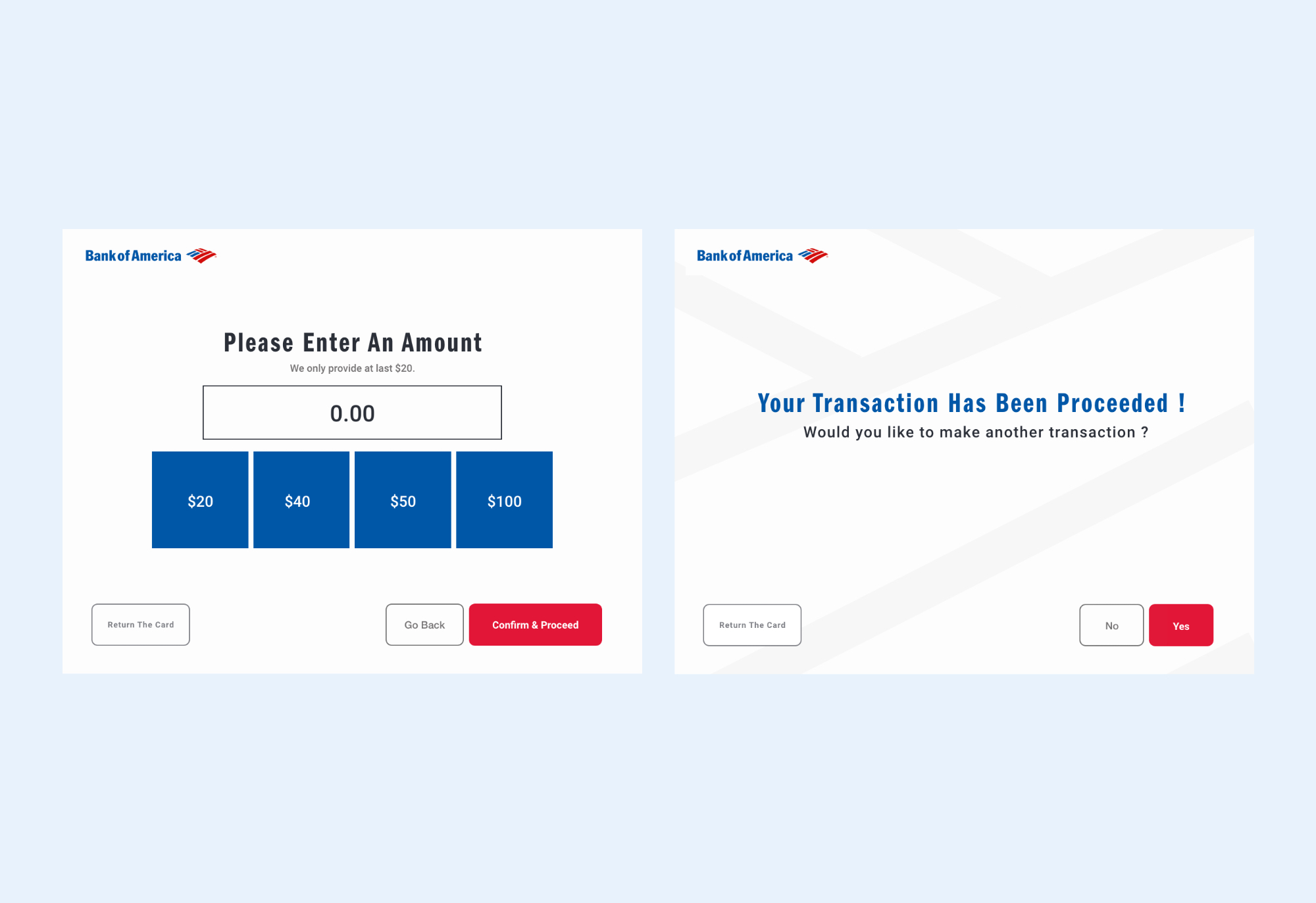
I became a user due to I’ve never used BOA’s ATM before. Then, I test each service to see the whole system to identify any usability problems.
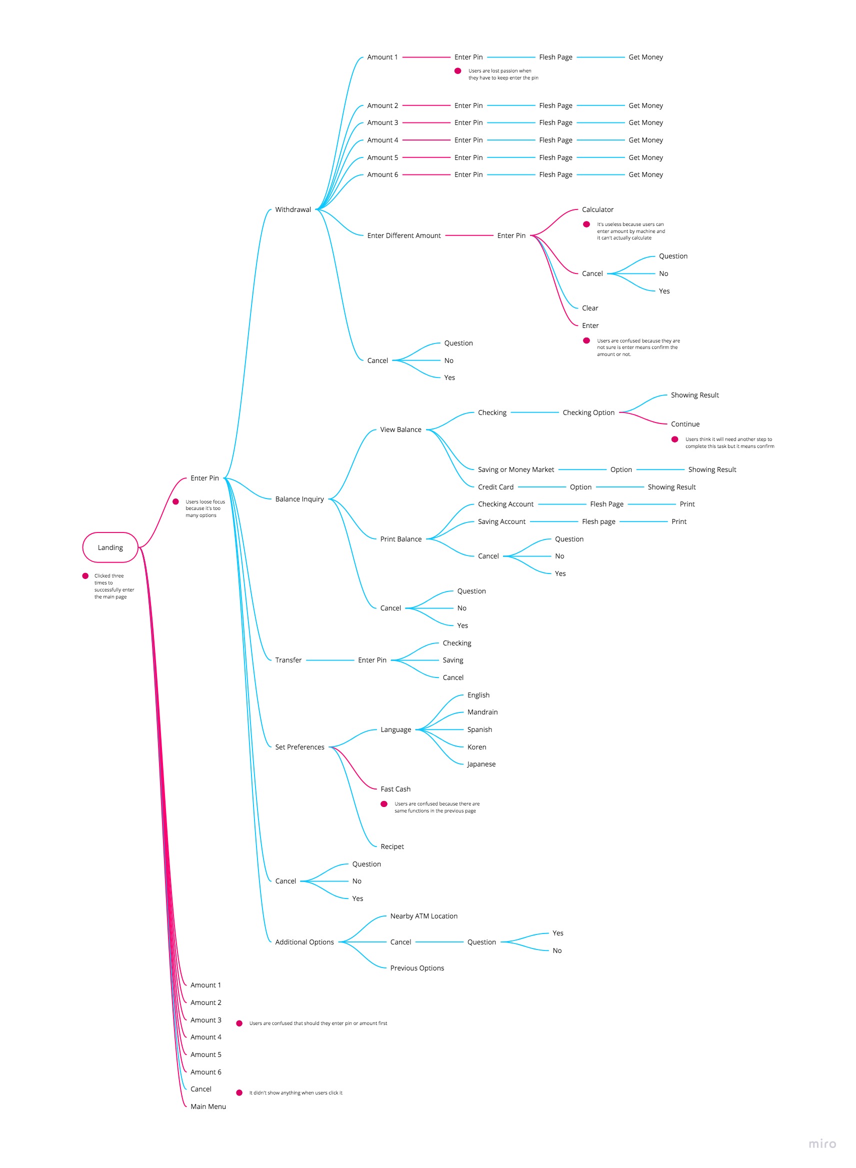
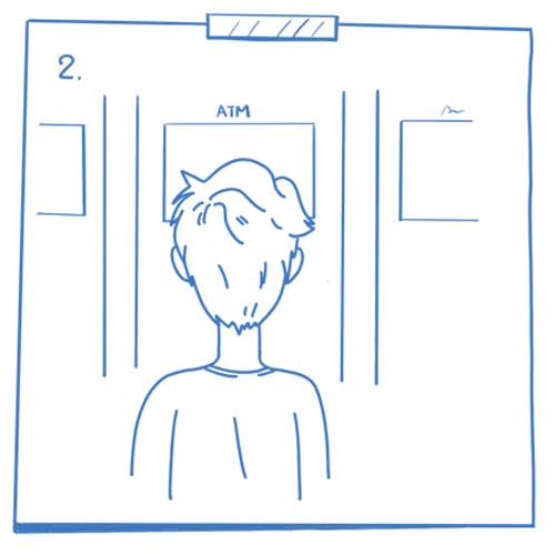
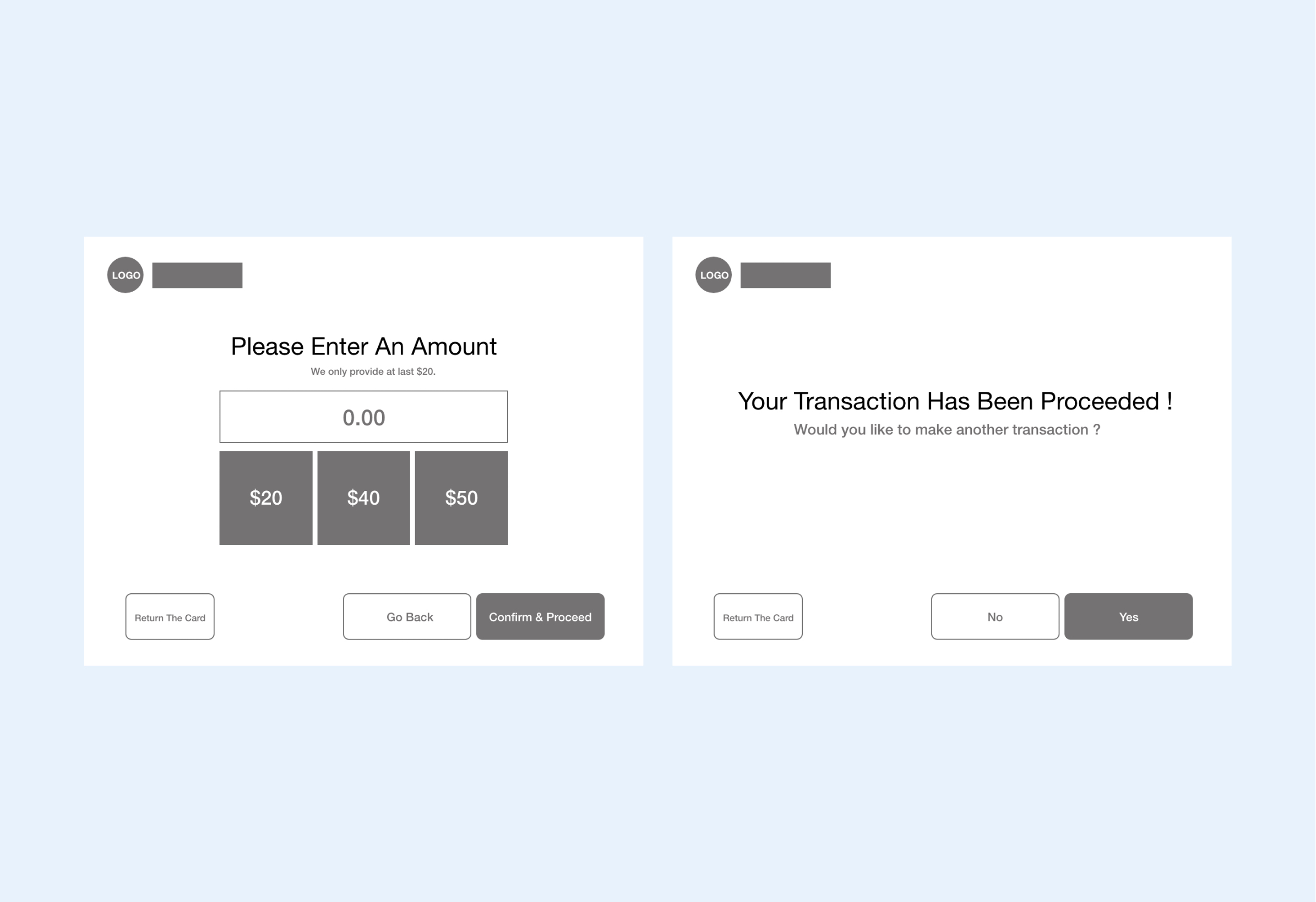
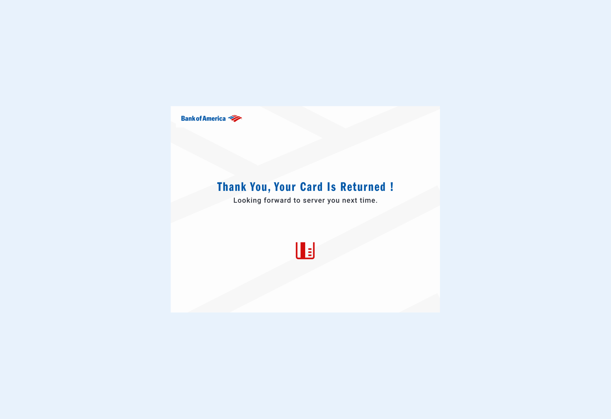
Here is the process for each transaction that I recorded from the original ATM design.
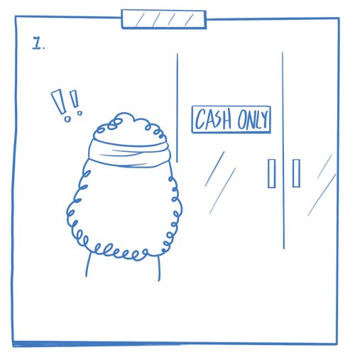
She doesn't have any cash
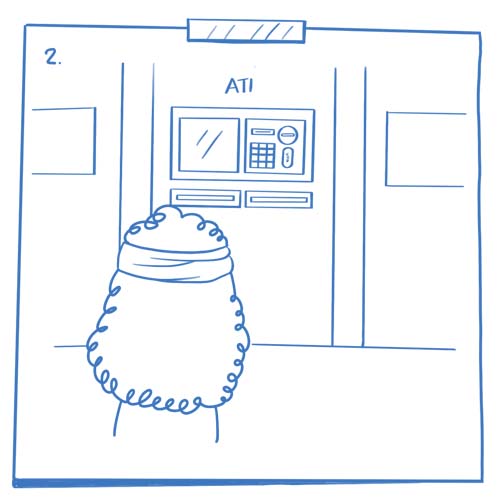
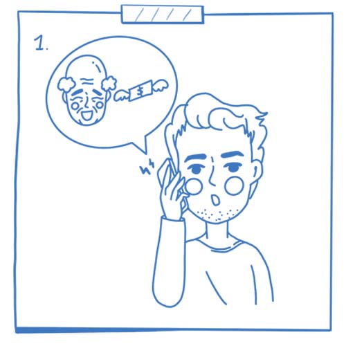
Go to ATM
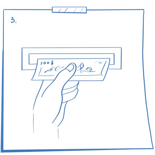
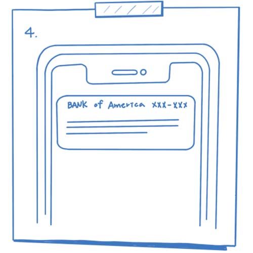
Get cash
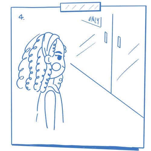
go back to the resturant
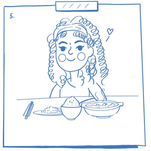
Enjoy the meal
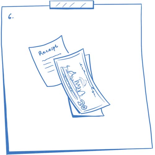
Pay it by bills

Uncertain if her kid has a peanut allergy
or intolerance
Concern her daily schedule
Access the app
Order an allergic testing online
Order is in the process
Get the testing result
I did two rounds of user testing for this project. I asked three users to manipulate the original design and modified design base on the task in each round of testing. It helps me to understand how they feel about these different designs.
According to the results of the users, they all completed their tasks. All Users agree that it's more efficient, memorable by reducing steps of transactions than the old version. One user thinks the hover of buttons is not clear enough, so she wasn't sure are buttons clickable and accessible.
They all completed their tasks faster than the first round of the testing.
One small detail may change the user's feelings when they're using the product, and that's what I learned from this project— for instance, I realized the action influence by the color of the buttons, the size, space, and hover effect after did the user testings. However, it's exciting to learn new things.